If you’ve sweat at the Cape House before you’ve likely noticed that the studio — just as Wellesley and Downtown Boston do — has its own look and feel.
In large, that’s thanks to Heather Vaughan, the Boston-based interior designer who curated the space from its exterior pops and its lighting to its interior vibe.
We sat down to hear what inspired her master plan, how she created its bespoke aesthetic, and the best ways to take in the space.
Q: How was this project different to past projects you’ve worked on in the past?
A: Most of my work is in residential interiors so having the opportunity to design The Cape House was an exciting challenge. Designing this space with B/SPOKE has been wildly freeing from a creative perspective. We were allowed, encouraged even, to be bold and fearless. I believe this energy is infused into the space.
The vibe of a space can have such an impact on your energy. What type of mood did you try to create?
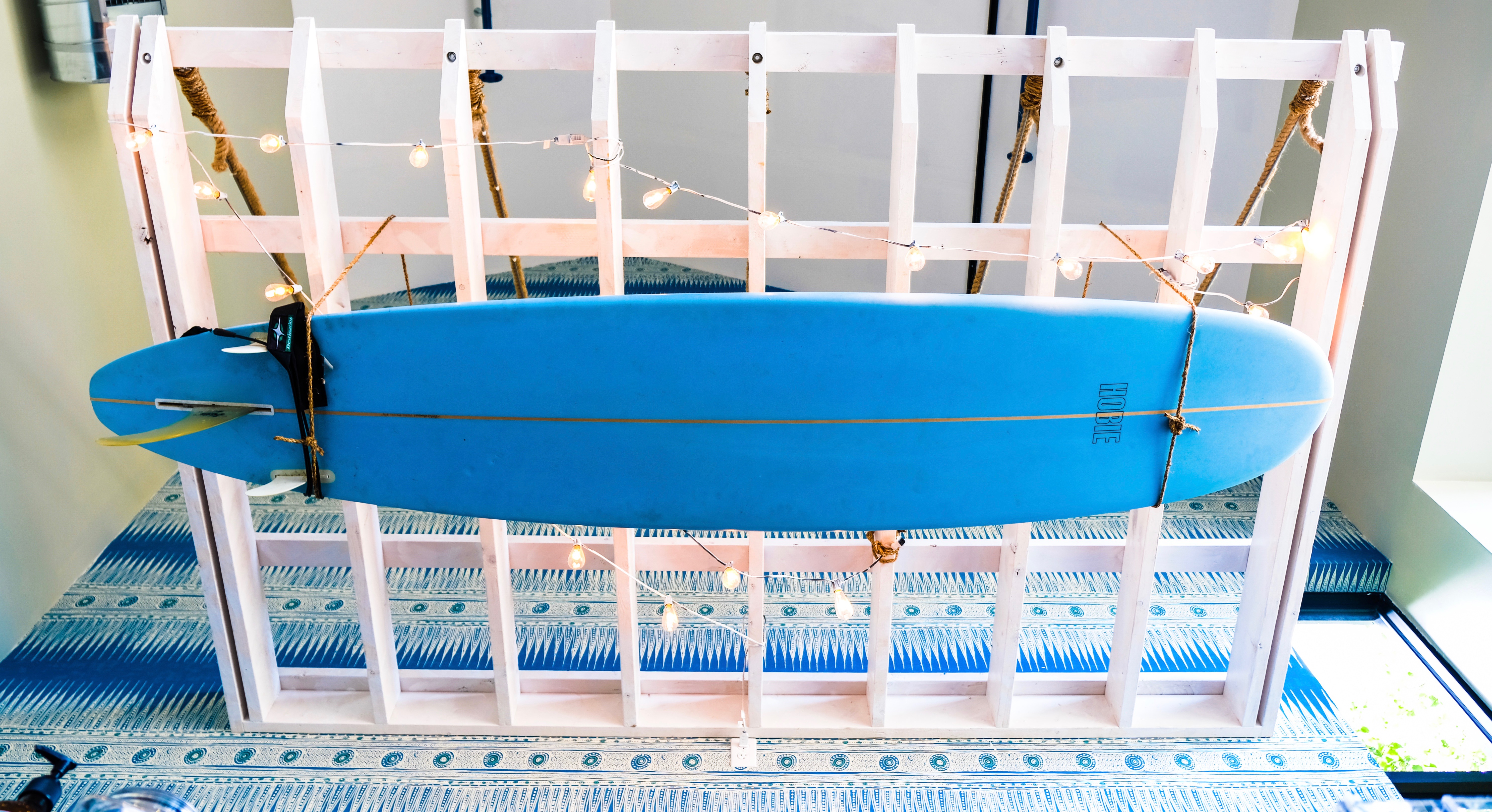
Evoking a vintage surf shack vibe, we created a visually delightful space with an atmosphere that encouraged high energy. We achieved this through layers of materials, starting with the boldly-patterned wallpaper as a cool backdrop to the curved front desk. I love the way this wallpaper looks like a vintage batik textile.
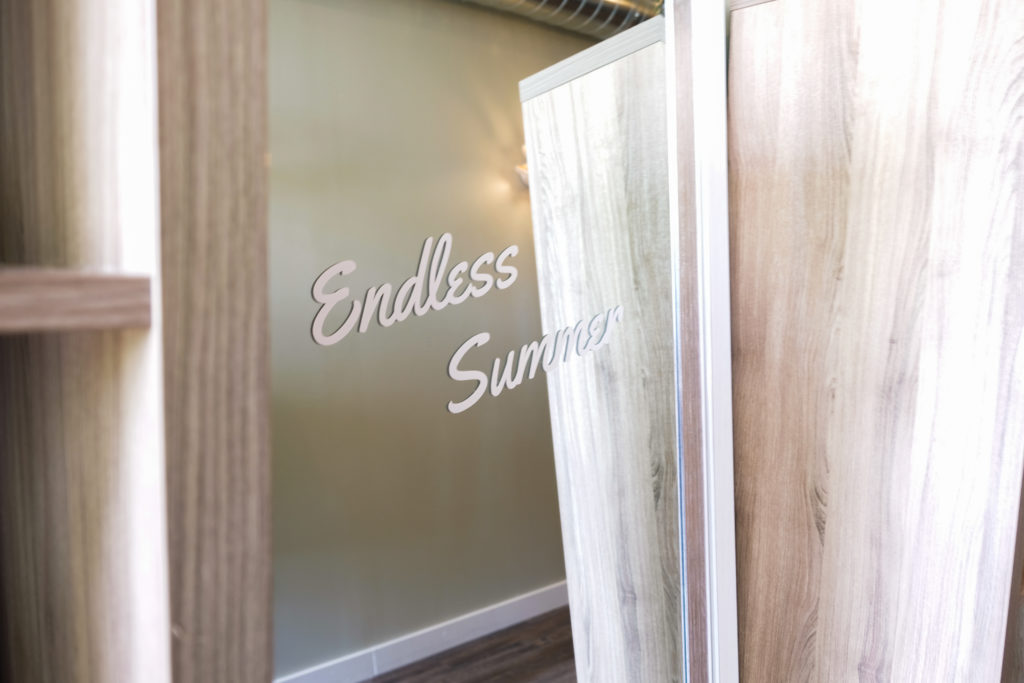
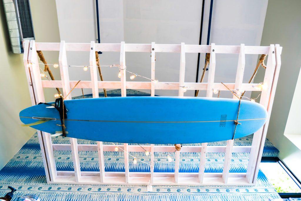
With the whitewashed pergola loosely strung with cafe lights over the front desk and a surfboard tucked into rope hammocks, our goal was for people to feel as though they were on vacation, living the salt life, kicking back—endless summer vibes.
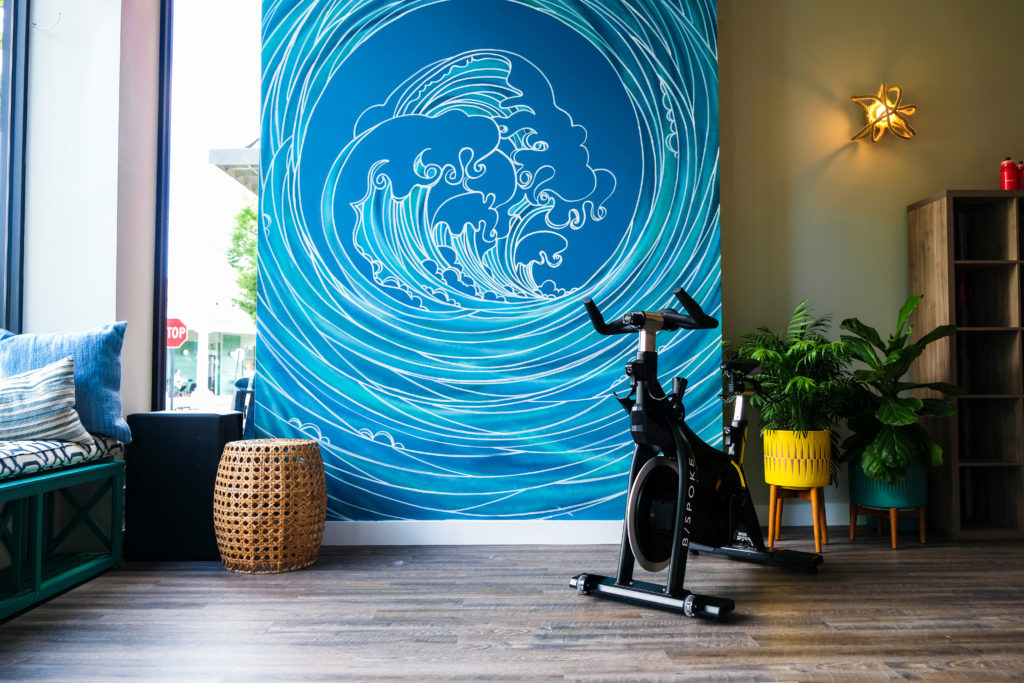
The full-height art piece created by Erica (@blindfoxart) is so impactful and energizing. It’s exactly what the space needed. We wanted the energy of the wave wall to pull you in.
That’s a very impressive piece! There’s several different lighting aspects to see in this space. What was your vision for the lighting?
We took a classic beach vibe and turned it on its head. We used hemp rope in some conventional and unconventional ways, especially in the lighting. You’ll see a nod to nautical (a little lobster buoy, custom painted ceiling pendant, rope twists, sconces, and knots). The basket pendant light installation is one of our faves. Each is unique. We even went so far as to paint the pendant interiors.
The wave wall carries your eye up the wall to the pendants and each has color injections that are then used throughout the rest of the space on bench cushions, pillows, and striped doors.

How about the exterior design?
The soft green X-based benches topped with a hodgepodge collection of colorfully-textiled pillows are crucial to adding a cozy, welcoming vintage feeling. We want people to feel as if they’re at their own Cape house. Farrow and Ball Hague Blue is ‘our’ signature blue.
What’s your favorite aspect of the space?
The curved wicker front desk. I love the old Cape Cod feel—how it connects to the wallpaper behind it. It balances out the oh-so-lovely wave wall, which I may just be equally in love with.
What’s your go-to workout?
I love to walk outside. I take off my shoes and walk barefoot. I’m lucky enough to live on the water and stroll the beach. It balances my busy, creative brain and grounds me.
How do you want people to feel in the space?
I want them to feel visually delighted by this unique and special studio space. We hope they feel a sense of home and of being part of a community because that’s what B/SPOKE is all about. Each of their studios is different, and this—this is the Cape House. It’s not just a building or a room. It’s a community. The positive energy is all B/SPOKE. We were just lucky enough to be a part of creating the surroundings that contain it.
To see more of Heather’s work, check out her website and Instagram.